
In part 1 of this blog series covered the overall onboarding journey of your users. In part 2, we took a close look at the admin journey.
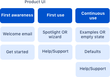
Now we can focus on the end-user and building awareness of your app, then teaching users to use your app competently. This flow shows key steps in the journey vendors control and best practices at each step from the perspective of the end user.
Users’ mindset
-
Users are focused on achieving their own goal. Remember users are trying to get their job done, they're not poking around Jira for things that have changed overnight.
-
They might have requested the app be installed, they might not have.
-
Don't rely on admins to communicate directly to users without a prompt. Think large orgs.
Step 1: First awareness
At this stage the admin has installed the app, and the end user has no idea anything has changed. First awareness is about notifying the user that the app has been installed, and get them excited about using it.
Welcome email
For the end user, the welcome email is a notification that something in the product has changed and will require different content from the admin email. The welcome email to end users should pitch the value of the app to the user, make them want to use it. The email should have a call to action, pointing the way to getting started.
Get started page
This is similar to the get started page in the admin experience, but with a different purpose. The admin get started page is focused more around configuration and getting the app ready for end users.
If your app requires some configuration by the end user, it may also be necessary to include getting started tutorials and educational content. This page contains content the user should only have to refer to once, it should be lightweight, clear and concise. Don’t forget to include help and support links.
Step 2: First use
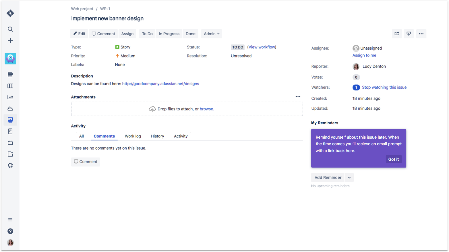
Some features are quite subtle and users may never know they exist. A great way to help the user learn about changes and new features is to pop a dialog that introduces the feature. This should only show to the user the first time. After dismissing it, it should not show again.
Server apps will have more flexibility when it comes to using the following patterns.
- In product help: The AUI/ADG2 in product help pattern is a great way to indicate features in the UI.
-
Spotlight: This is one of our new ADG3 patterns, spotlight, which is used to ease users into using the app from within the Atlassian product. The spotlight improves engagement by introducing users to new features and functionality at relevant moments.
-
Limitation in cloud apps Only cloud apps can use the spotlight pattern within a whole page iframe. Navigation integration points don’t allow this pattern, unfortunately.
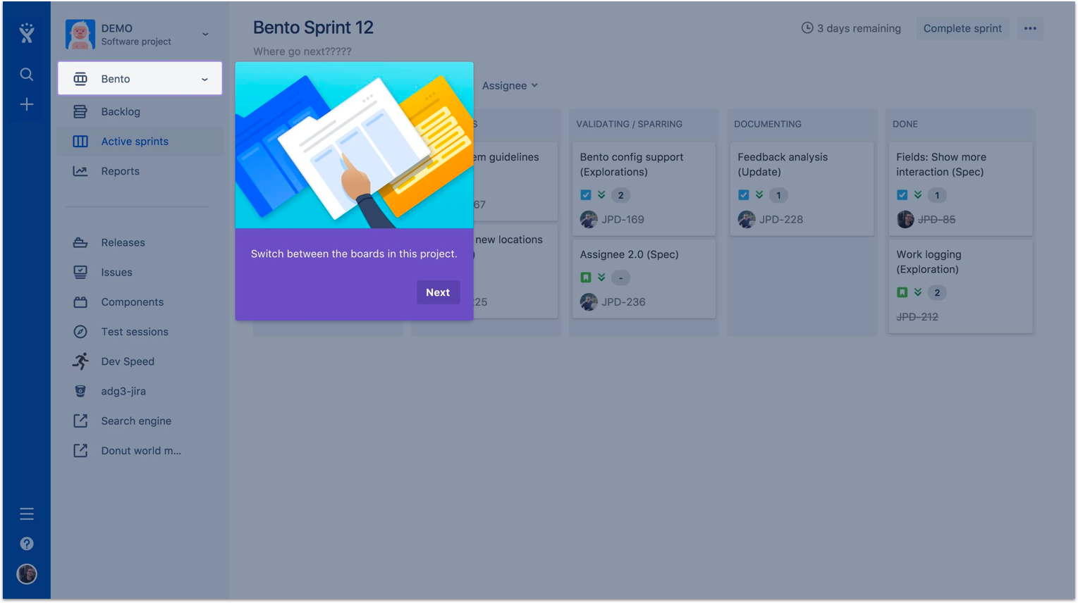
Here is a spotlight variation you can use within a smaller iframe.
![]() Why purple?
Why purple?
- In our ADG design systems, we indicate "new" features in the UI with the color purple, seen in several patterns.
![]() Do this
Do this
-
If you have more than one step, make sure you allow the user to skip forward.
-
Always allow the user to cancel or close the wizard.
![]() Don’t do this
Don’t do this
-
Don’t trigger a wizard or onboarding modal beyond the first encounter with each user.
-
Don’t use a wizard or onboarding modal if your app is simple and it’s clear where to go.
Step 3: Continuous use
Empty states
An empty state appears when there are no items to be shown. Rather than showing a blank screen, which could come across as 'something is broken'. When designing a landing page or empty state, what is the primary action you expect users to take? Lead the user through information with obvious first and next actions. Support and documentation links should be available, but secondary.
![]()
Now the user has completed their first tasks using your app, they're getting a feel for how it works in the product. It's important to continue supporting your users.
Examples, defaults, help and support
During first use, you don't have to show users every feature at once. Be opportunistic with educating users, show them new things on a need to know basis. This also gives you an opportunity to enhance their perspective of the app.
Examples, defaults, tool tips, UI copy. These are not so much on boarding best practices, but rather design best practices in general.
Tip text for date input
Defaults, help and support
Remember your users might not live and breath your app as you do, they might use it a couple of times a week, maybe less. Give them ways to recall what is expected of them.
This post completes a three part series about designing for discovery and onboarding in cloud and server Atlassian products. Please check out the full series!
Resources