
We're thrilled to announce that a major redesign has now rolled out for all Atlassian API reference pages. This process began in April, when we introduced the new design for Jira Cloud and Confluence Cloud API references. We believe this update will make it easier than ever for you to navigate, find information, and understand how to use our APIs effectively.
Why we did the redesign
The existing API reference pages had several usability issues that made it difficult for developers to quickly find the information they needed. Some of the issues that we identified were:
- The high density of information make it hard to quickly scan and identify important information such as required parameters
- On smaller screens, there was a lot of scrolling between the content and code samples
- Difficult to find the right endpoints, especially when the resource had a lot of endpoints
- The existing design was starting to look dated
Walkthrough of the major improvements
One of the biggest changes in the new design is the introduction of the three column layout. The left column contains the revamped navigation while the middle one displays the main content including detailed explanations of each endpoint, parameters, and query options. The right column contains the code samples and responses that are relevant to the corresponding content. This layout is designed to streamline your learning process and improve productivity by making it easier to absorb the information.
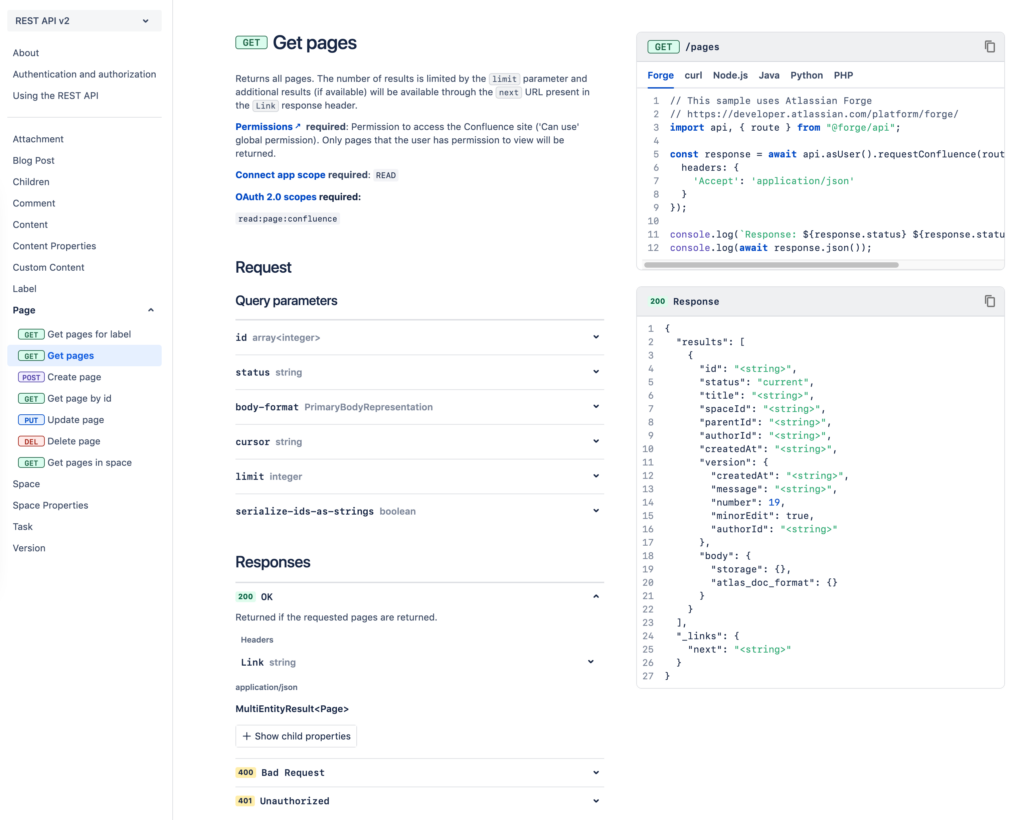
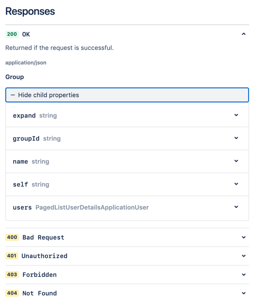
We tackled the issue of information overload by adopting an approach of progressive disclosure of information. The most vital information such as 200 responses, top level parameters etc is made available by default whereas information such as parameter descriptions, child properties, error responses etc are visible after a click.
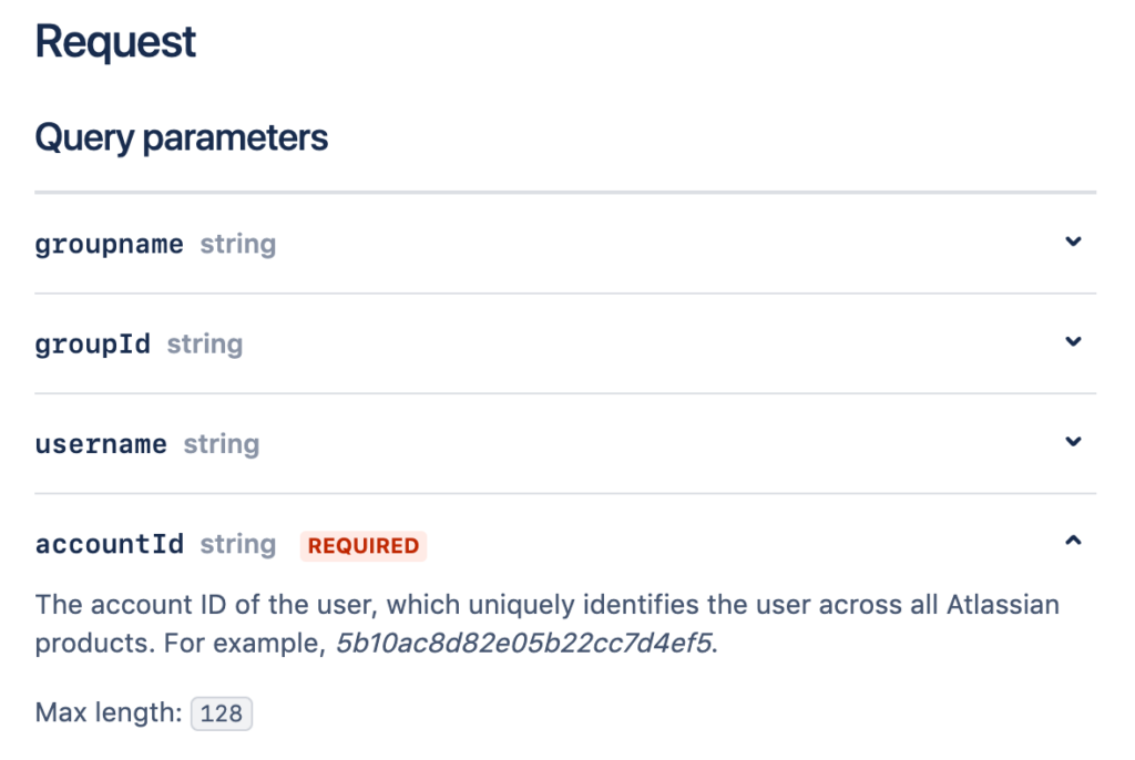
With usability as our top priority, we have made several improvements to the overall user experience. This includes updated typography and information design to make the content clearer and easier to read. For example, in the section headings, required parameters and response types stand out more through a combination of spacing and font weight and colors.
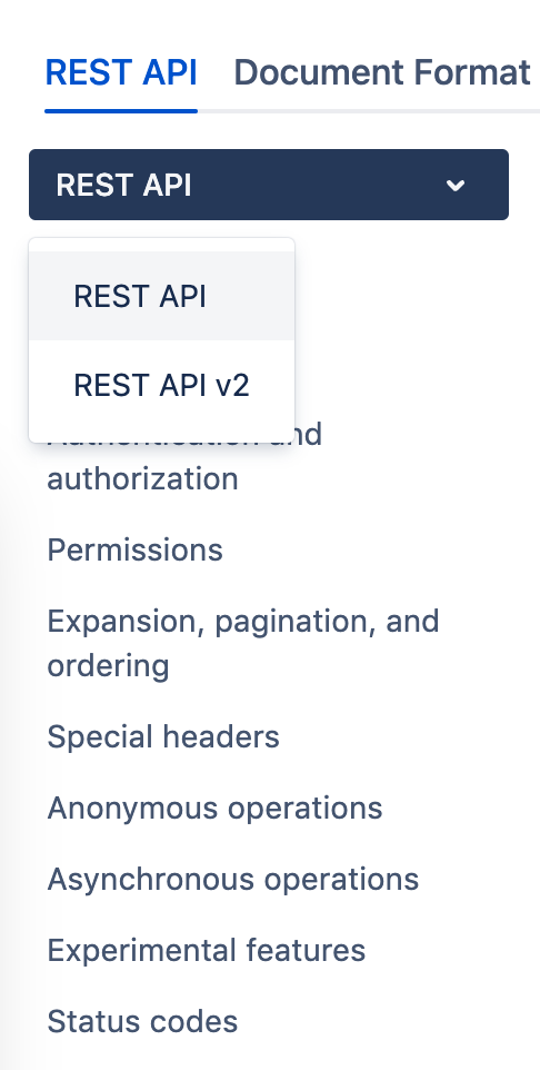
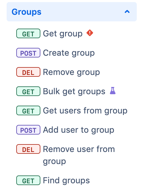
In the navigation panel, you'll see a version menu so that you don't have to switch tabs to view documentation for REST APIs that have more than one version. We have updated the page tree, making it quicker to identify the method each operation uses and whether it's deprecated or experimental.
What's next?
As we continue in our journey to improve our developer resources, your feedback is invaluable. We’d love to hear your thoughts on the redesigned API reference pages, as well as any suggestions for further enhancements or additional features you’d like to see. You can share your feedback by reaching out to us through the Atlassian Developer Community or via the “Give feedback” button on the top right of the newly redesigned API reference pages.